
PREDICTION · EXPLAINABILITY
California housing
Comparing linear and nonlinear housing-price models through predictive performance, error diagnosis and post-hoc explainability.
Aix-Marseille School of Economics
- Team
- 6-person team
- Scale
- 20,640 block groups
- Contribution
- Modeling & analysis
From a familiar regression benchmark to a study of where predictive accuracy holds, where it fails, and what model explanations can actually tell us.
The challenge
Prediction was only half the problem.
California Housing is a familiar regression benchmark, but predictive accuracy alone says little about whether a model can be understood, diagnosed, or trusted. The project therefore approached price estimation through a second question: how much predictive performance can be gained before the model becomes too opaque to interpret?
The dataset contains 20,640 California census block groups described by eight numerical features. Beneath that apparent simplicity lie three characteristics that materially shape the modelling problem: nonlinear relationships, strong spatial structure, and a target distribution artificially capped around $500,000 for roughly 5% of observations.
Nonlinearity. Housing value does not respond uniformly to income, density, occupancy or location. A linear baseline therefore provides a useful reference, but cannot capture much of the structure available to nonlinear ensemble models.
Spatial structure. Latitude and longitude contain information that simple pairwise correlations only partially reveal. Coastal metropolitan areas, inland regions and local housing markets form distinct spatial patterns that become increasingly important once interactions are modelled.
Target censoring. The dataset imposes an upper ceiling near $500,000. This affects more than the target distribution: it creates a region in which prediction errors become systematically larger and later exposes an important distinction between a model that is explainable and one that is actually correct.
The task was therefore not simply to minimize error, but to understand what was gained — and lost — as model complexity increased.
Reading the structure
The strongest signal was not the whole story.
Median income provided the clearest first-order relationship with housing value. Among the original variables, MedInc showed the strongest simple correlation with the target, at approximately r = 0.69.
But correlation alone left an important part of the structure unexplained.
Housing values were also strongly organized in space. When observations were mapped through latitude and longitude, higher-value areas concentrated around major coastal markets, while inland regions followed markedly different price patterns. The geographical variables therefore carried information that was difficult to reduce to a single linear relationship.
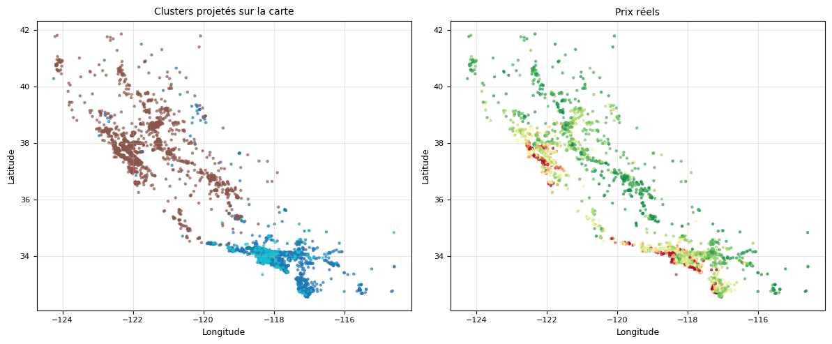
A PCA projection summarized much of the overall variation — 62.8% across the first two components — but mainly exposed a continuous gradient. Nonlinear projections produced a more differentiated representation of the observations, motivating the decision to test models capable of learning nonlinear thresholds and interactions rather than assuming a linear specification from the outset.
Income explained part of the variation. Geography revealed how that variation was organized.
The next question was whether model complexity could capture that structure without sacrificing the ability to understand it.
Building the comparison
Complexity had to earn its place.
Rather than selecting a high-capacity model directly, the project first established a broad performance baseline. A PyCaret screening compared 18 regression algorithms under 10-fold cross-validation, spanning linear, bagging and boosting approaches. LightGBM and XGBoost emerged at the top of the benchmark, while Ridge provided a deliberately simple and interpretable reference point.
From that screening, three models were retained for deeper investigation.
Ridge — a regularized linear baseline: transparent, stable, and useful for measuring how much predictive structure was inaccessible to a linear specification.
Random Forest — a nonlinear bagging model capable of capturing interactions without the sequential boosting mechanism of LightGBM.
LightGBM — the leading boosting candidate: highest-performing in the initial benchmark and the primary model for subsequent optimization and interpretation.
For each retained model, hyperparameters were explored using both GridSearchCV and Optuna. Optimization was performed through 5-fold cross-validation on the training partition, while the 20% test set remained reserved for final evaluation.
PyCaret — broad screening. GridSearchCV / Optuna — controlled hyperparameter optimization. Held-out test set — final evaluation.
The comparison was designed to answer a simple question: how much predictive accuracy did nonlinearity actually buy?
What the experiments showed
Nonlinearity paid for itself.
The held-out test set made the difference between the linear and nonlinear models explicit.
Ridge provided a useful baseline, but its predictions remained widely dispersed around the ideal diagonal. After tuning, it reached an RMSE of 0.716, an MAE of 0.522, and an R² of 0.604.
LightGBM substantially narrowed that error. The GridSearchCV configuration reached an RMSE of 0.442, an MAE of 0.286, and an R² of 0.849 on the same held-out test set.
Because the target is expressed in units of $100,000, these values correspond approximately to $71.6k RMSE / $52.2k MAE for Ridge and $44.2k RMSE / $28.6k MAE for LightGBM.
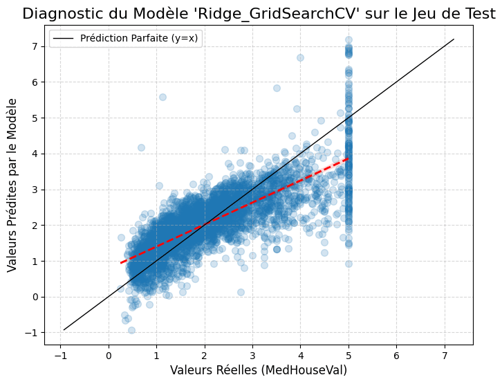
Ridge
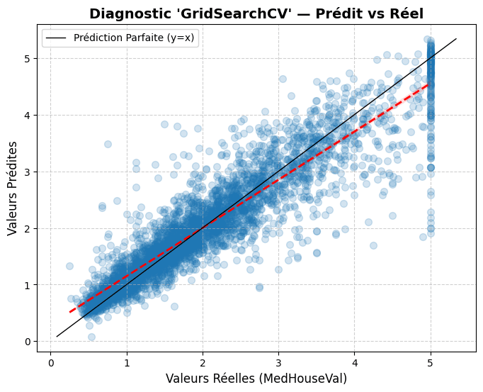
LightGBM
Relative to Ridge, LightGBM reduced held-out RMSE by approximately 38% and MAE by approximately 45%, while raising R² from 0.604 to 0.849.
The gain was large enough to justify the additional model complexity. But a strong global score still answered only one question: how well did the model perform on average? It did not tell us where the model failed.
Aggregated metrics suggested a strong model, but prediction error was not distributed evenly across the housing market.
When the test observations were divided into price quintiles, mean absolute error increased steadily with property value. The lowest-price quintile produced an MAE of approximately $17.2k. In the highest-price quintile, it reached $49.7k.
That is a 188% increase in absolute error from Q1 to Q5.
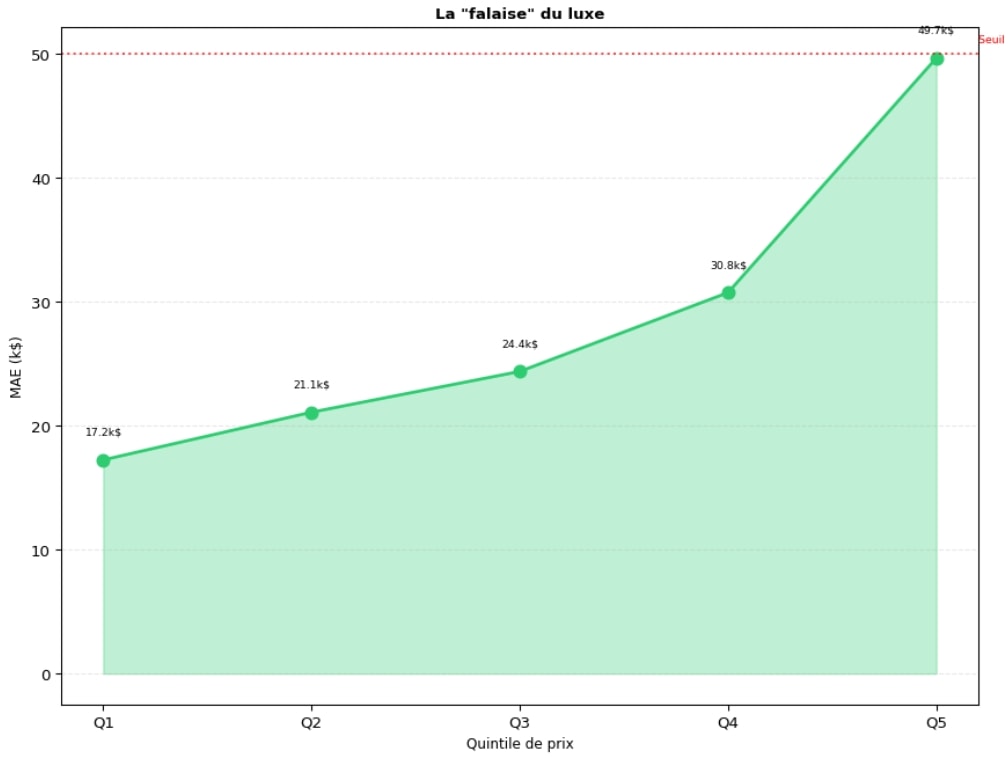
The deterioration was strongest near the dataset ceiling around $500,000, where materially different property values can collapse onto the same recorded target. The rise in absolute error coincides with that censored upper tail; censoring likely contributes, without being formally proven as the sole cause.
A model with R² ≈ 0.85 could still be almost three times less accurate at the upper end of the distribution.
Understanding that failure required asking what the model was actually using to make its predictions.
Opening the black box
Correlation highlighted income. Model explanations elevated geography.
The exploratory analysis had identified median income as the strongest simple correlate of housing value. Once the nonlinear model was opened, a different hierarchy emerged: Latitude, then MedInc and Longitude, with occupancy and average room count completing the top five.
The result did not contradict the earlier correlation analysis. It showed that the model was using location in combination with the rest of the feature space.
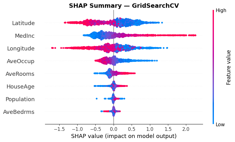
Geography became a model-level signal — Latitude, MedInc, Longitude, AveOccup, AveRooms — in that order. Correlation described isolated relationships. SHAP revealed how the fitted model combined them.
Feature rankings from permutation importance and the Ridge coefficients provided two further reference points. The rankings were not identical — nor should they have been — but the broad structure remained aligned.
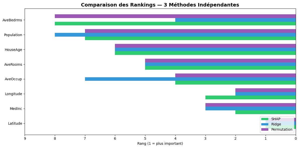
Agreement was strongest between SHAP and permutation importance (Spearman ≈ 0.89), and remained substantial with Ridge (≈ 0.76). That alignment supports the hierarchy as a model-level pattern, not as causal evidence.
The model was no longer a black box in the strict sense. But explanation raised a harder question: could a prediction be perfectly explainable and still be wrong?
What we learned
An explanation can be coherent even when the prediction is not.
Global explanations describe what a model tends to use. Local explanations ask why it produced one specific prediction.
One observation made that distinction concrete. Its recorded value sat at the dataset ceiling, around $500k, while LightGBM predicted approximately $199k — an error of more than $300k. The SHAP decomposition was nevertheless internally coherent.
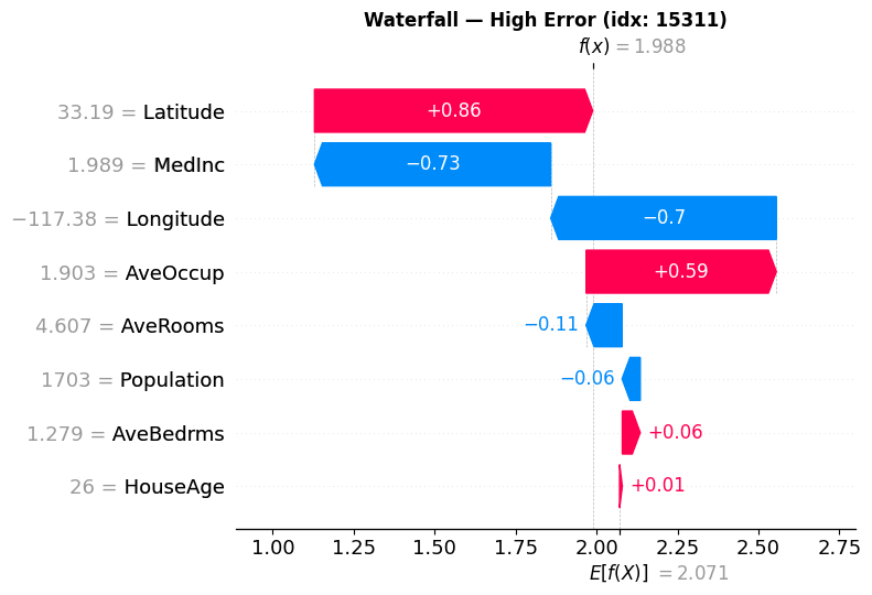
SHAP could account for the path from the model’s baseline to approximately $199k. What it could not establish was whether that prediction was correct.
The case belongs to the same censored upper-tail regime identified earlier. Censoring plausibly contributes to the failure; the explanation remains faithful to the model.
Interpretability does not imply correctness.
Explanation answers “Why did the model predict this?” It does not automatically answer “Should the model have predicted this?”
This failure case became the starting point for a separate experiment: fixing LightGBM and comparing complementary ways of interrogating it — from global effects to individual predictions.
The best model was not the end result.
LightGBM justified its added complexity. Global performance was uneven. Interpretability made the model inspectable without certifying that its predictions were correct.
01
Complexity was measurable
Nonlinearity was not adopted because it was theoretically attractive. It earned its place through a large and consistent improvement over the linear baseline on the held-out test set.
02
Average performance was incomplete
A single RMSE or R² concealed a highly uneven error distribution. Segment-level diagnostics changed the interpretation of what initially looked like uniformly strong predictive performance.
03
Explanation and validation are different tasks
Interpretability could reconstruct why LightGBM produced a prediction. It could not determine whether the learned relationship was economically true, causally meaningful, or reliable outside the information contained in the dataset.
The project therefore moved from selecting the most accurate model to understanding the conditions under which that accuracy could be trusted.
Model choice
- Selected model
- LightGBM
- Why
- Best held-out predictive performance among the investigated models.
- How it should be used
- With segment-level diagnostics and model explanations, not aggregate metrics alone.
- Where caution is required
- High-value observations near the censored upper tail.
Limits of the evidence
Strong predictions do not remove weak assumptions.
The conclusions remain bounded by the data and evaluation protocol.
Target censoring. Values near the upper end of the housing distribution are truncated by the dataset ceiling. The model therefore receives incomplete information precisely where prediction errors become largest.
Geographic dependence. Latitude and longitude are powerful predictive signals, but they should be read as spatial proxies rather than causal mechanisms. They may encode many unobserved local characteristics at once.
Random held-out evaluation. The test split measures generalization to unseen observations from the same dataset. It does not establish transfer to unseen geographic regions or a different housing market.
Interpretability is model-dependent. SHAP, permutation importance and linear coefficients describe the fitted models from different perspectives. Agreement increases confidence that a pattern matters to the models; it does not turn that pattern into causal evidence.
Benchmark scope. The project evaluates a fixed tabular dataset under supervised regression. It does not include temporal market dynamics, transaction histories, richer local amenities or external economic variables.
The central limitation was therefore not computational. It was informational: the model could only learn the housing market represented by the variables, target construction and sampling scheme it was given.
Closing
Prediction was the entry point. Diagnosis became the real problem.
A nonlinear model improved accuracy; segment analysis showed where that accuracy failed; interpretability exposed what the model had learned — and where explanation itself reached its limit.
A useful model is not only one that predicts well, but one whose performance, failures and assumptions can be inspected separately.
Techniques & technologies
Techniques
- Regression
- Model benchmarking
- Cross-validation
- Hyperparameter optimization
- Feature engineering
- Explainability
Technologies
- Python
- scikit-learn
- LightGBM
- PyCaret
- Optuna
- SHAP






References
The modelling and interpretation work drew on standard treatments of supervised learning, regularization, ensemble methods and model assessment.
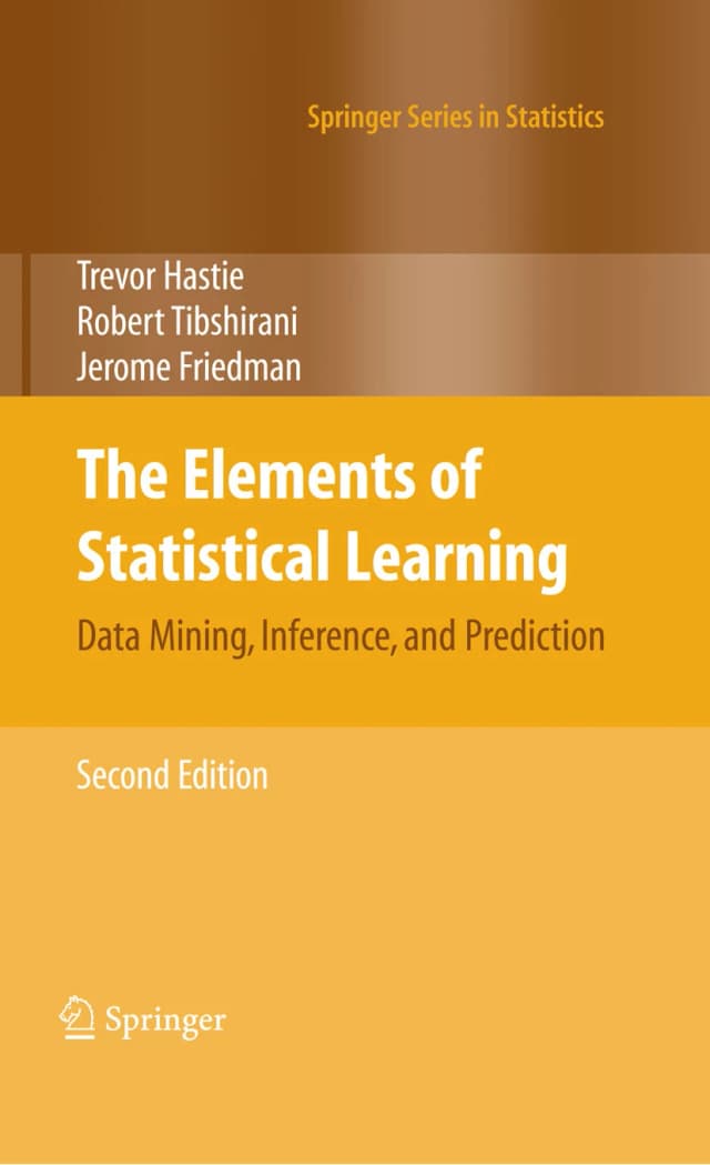
Trevor Hastie, Robert Tibshirani & Jerome Friedman — The Elements of Statistical Learning
Supervised learning foundations, linear methods, regularization, trees and ensemble methods, model assessment and the bias–variance trade-off.